Few months ago, I stumbled upon Pete‘s Build for Mars. I really like the format they use for UX case studies and I thought I could try to replicate it for a Czech banking app (Don’t worry, I switched the app interface to English).
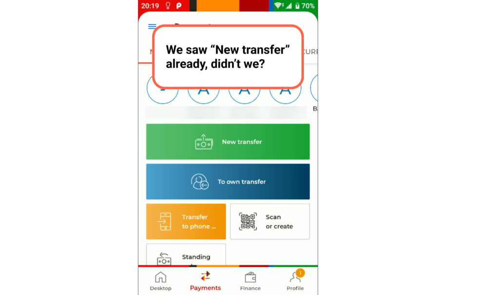
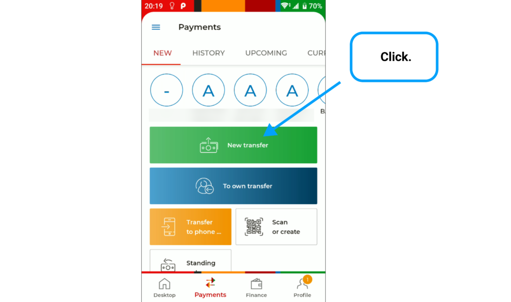
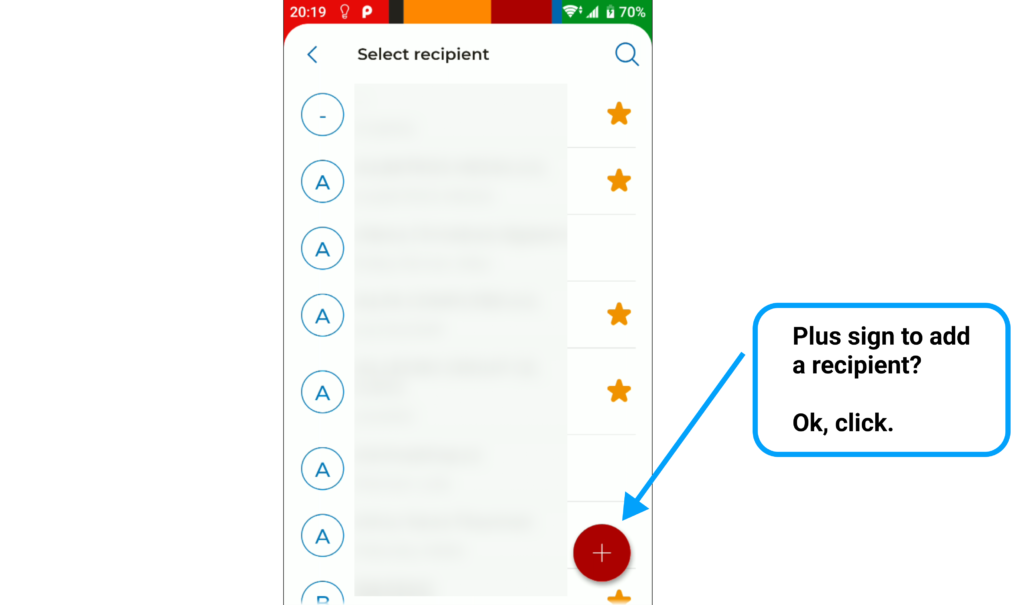
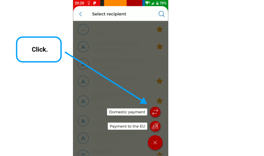
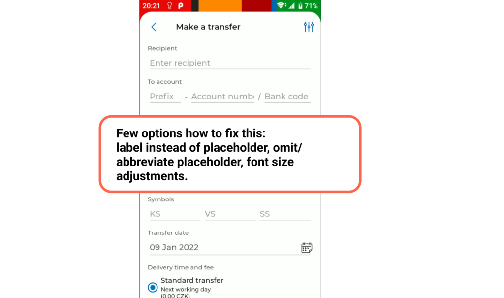
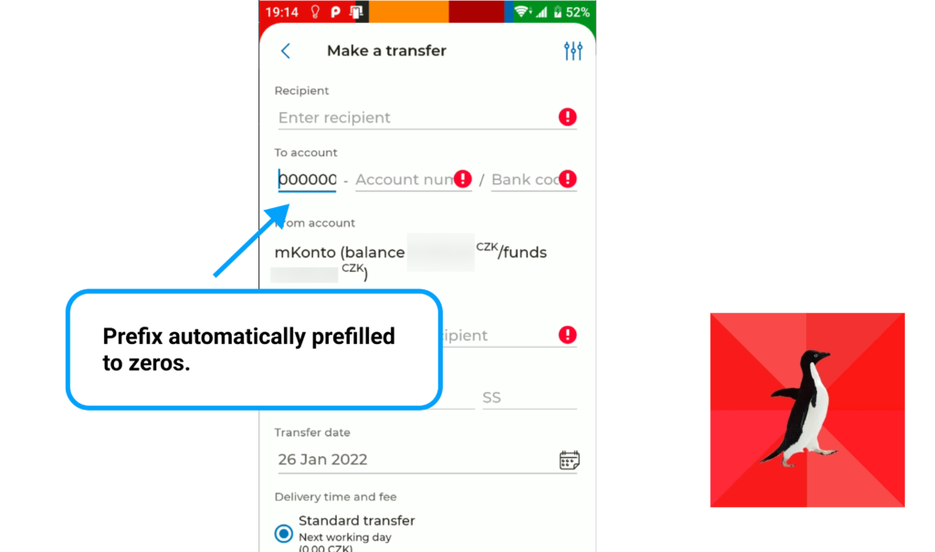
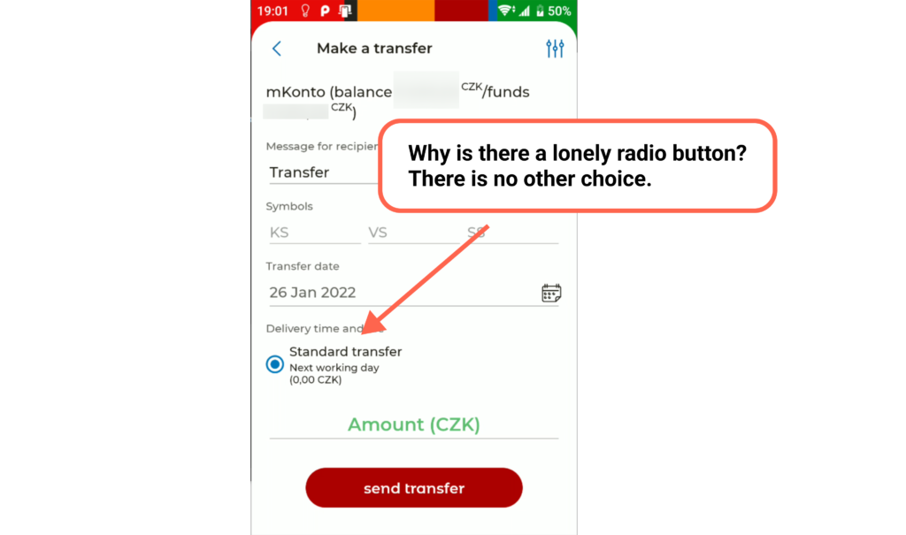
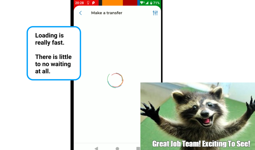
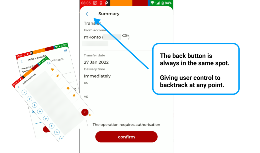
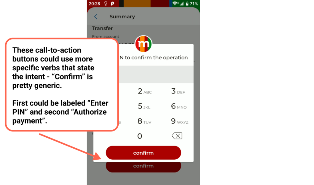
Overall, the user experience of making a payment with mBank app is really good. I did my best to find as many issues as possible. Yes, this means the most of issues are nitpicks.

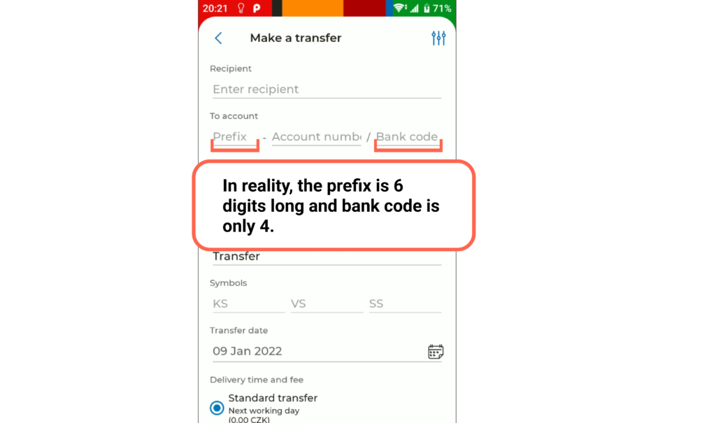
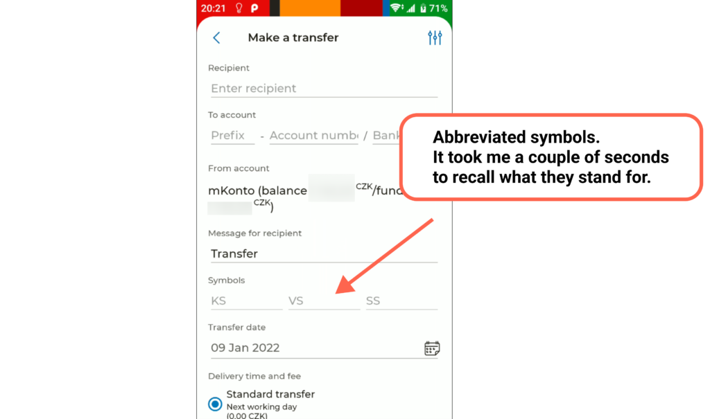
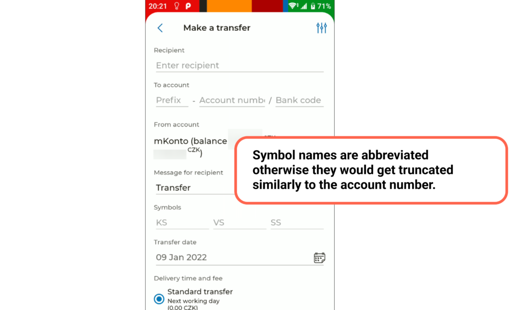
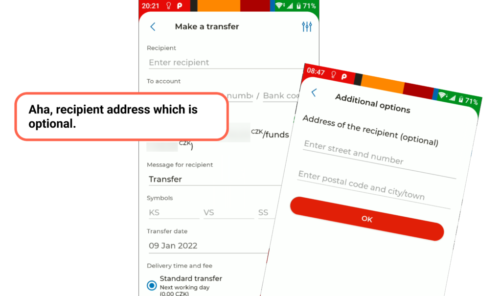
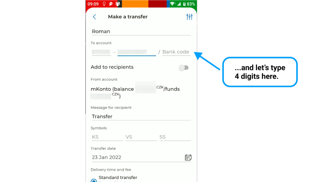
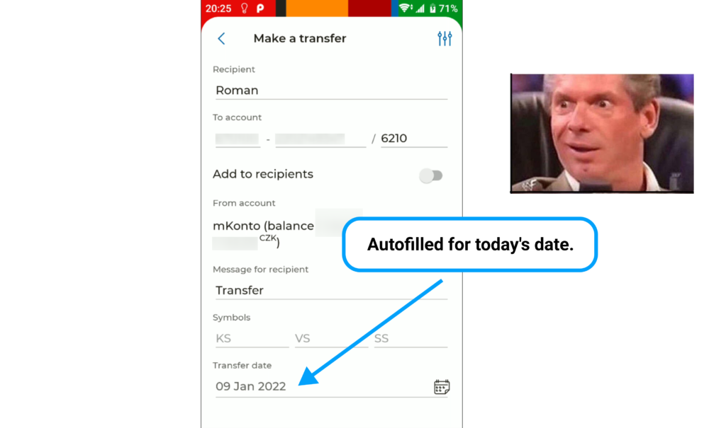
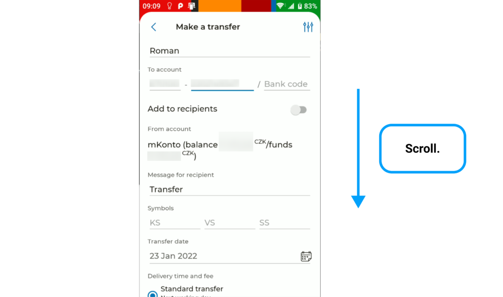
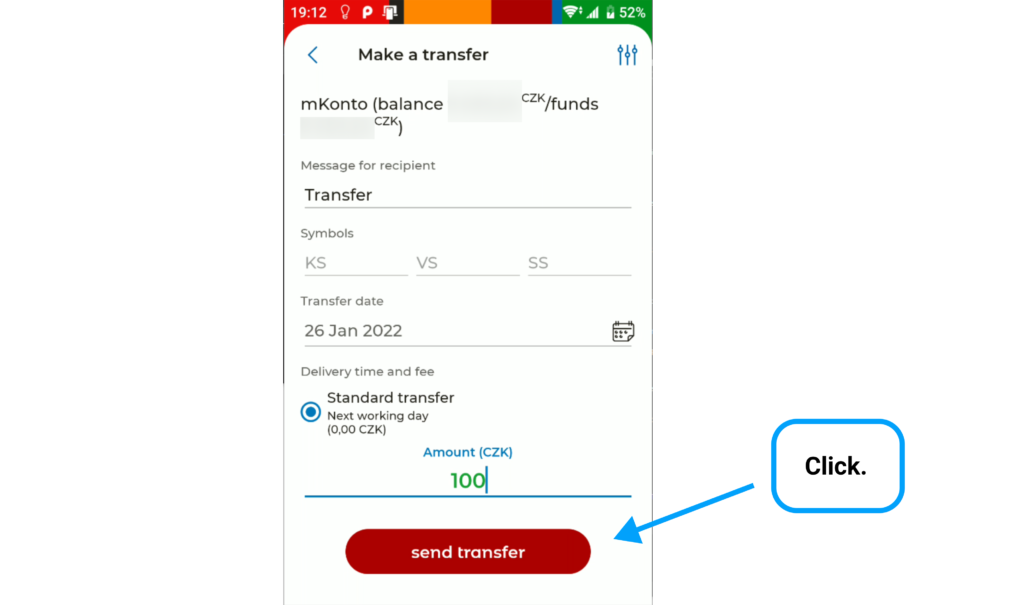
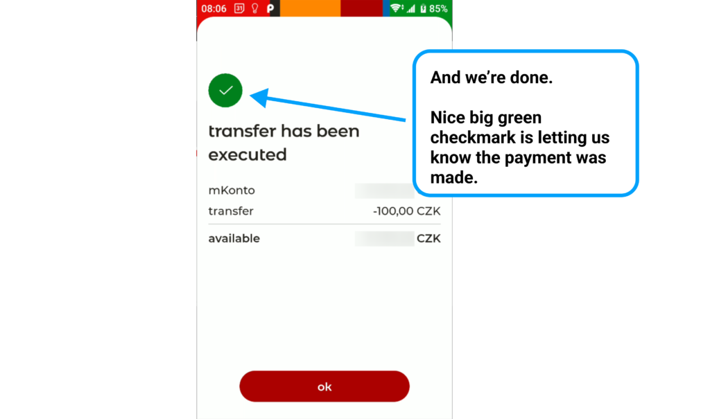
Note: I’ve blurred the screenshots where it shows my account balance, contacts, account number and history. Hopefully, it won’t distract you too much. I just value my privacy, that’s all.
Note 2: I took screenshots at different times – this is why you might see times and dates skip around throughout the presentation.
mBank case study
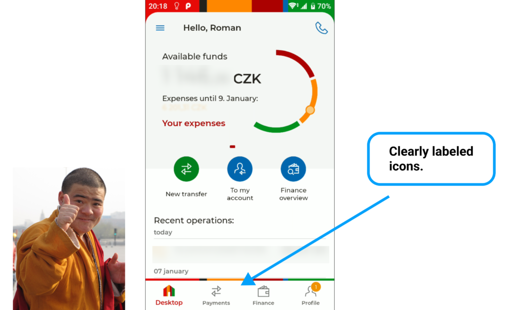
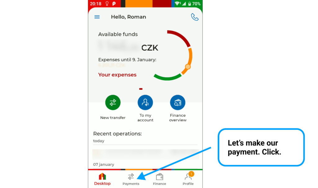
Here is the mBank app UX case study (made in Figma):


It was pretty fun to make this. Hope you enjoyed it as well.