During my studies at FH OOE I took a class on Usability/Interaction Design. The first task was to evaluate a website using guidelines (Mack & Nielsen). We were supposed to evaluate a (really) bad one but I wanted to try it on archive.org because I love what they do. Maybe my evaluation could help make it better for people to use?
Date: 2015
Team: Roman Luks
Guidelines (Mack & Nielsen)
• Visibility of system status: The system should always keep users informed about what is going on, through appropriate feedback within reasonable time.
• Match between system and the real world: The system should speak the users‘ language, with words, phrases, and concepts familiar to the user, rather than system-oriented terms. Follow real-world conventions, making information appear in a natural and logical order.
• User control and freedom: Users often choose system functions by mistake and will need a clearly marked „emergency exit“ to leave the unwanted state without having to go through an extended dialogue. Support undo and redo.
• Consistency and standards: Users should not have to wonder whether different words, situations, or actions mean the same thing. Follow platform conventions.
• Error prevention: Even better than good error messages is a careful design which prevents a problem from occurring in the first place.
• Recognition rather than recall: Make objects, actions, and options visible. The user should not have to remember information from one part of the dialogue to another. Instructions for use of the system should be visible or easily retrievable whenever appropriate.
• Flexibility and efficiency of use: Accelerators – unseen by the novice user – may often speed up the interaction for the expert user to such an extent that the system can cater to both inexperienced and experienced users. Allow users to tailor frequent actions.
• Aesthetic and minimalist design: Dialogues should not contain information which is irrelevant or rarely needed. Every extra unit of information in a dialogue competes with the relevant units of information and diminishes their relative visibility.
• Help users recognize, diagnose, and recover from errors: Error messages should be expressed in plain language (no codes), precisely indicate the problem, and constructively suggest a solution
• Help and documentation: Even though it is better if the system can be used without documentation, it may be necessary to provide help and documentation. Any such information should be easy to search, focused on the user‘s task, list concrete steps to be carried out, and not be too large.
Evaluation
Violation of guideline: Recognition rather than recall

Why is the guideline violated? There is no visible text describing each media icon. User has to hover over to see the alt text (“Audio” in the screenshot). As a user I was able to guess some of the icons but not all.

How can it be improved? Show the text at all times, perhaps under/next to the icons.
Violation of guideline: Help and documentation

Why is the guideline violated? Menu containing about, contact,.. help is hidden under the icon of Pantheon. Help should be easy to find. In my opinion hiding it like this partially violates this rule. At the same time user has to remember to click Pantheon icon to see the main menu. Also when exploring pages (projects, blog, etc) menu always hides again. So when user wants to go somewhere else they have to click Pantheon icon first to show the menu and then desired item. Two clicks are always required!
How can it be improved? It may be elegant to simplify website by hiding menu under the icon, but it violates the guidelines. One solution might be to make it clear that the icon is actually a button. Or just show the menu at all times.
Violation of guideline: User control and freedom/Aesthetic and minimalist design
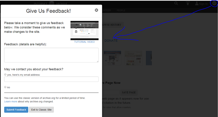
Why is the guideline violated? In the top right corner there is an exit button. As a user I had no idea what it supposed to do. After I discovered that it leads to the old version of site I am shown a dialogue of feedback. I don’t care about filling a feedback. I want to go the the classic version. So I have to find a greyed out button on the bottom. And also, what if user just to want submit a feedback. They wouldn’t look for it under exit button would they? Another problem regarding feedback is after submitting the feedback button exit to classic site disappears so user has to click exit button again and see the feedback form again and click the greyed out button.
How can it be improved? Change the button description from “exit” to “classic version” or something similar. Skip feedback entirely. Move it under separate button. Just separate these two things: feedback/old site.
Violation of guideline: User control and freedom

Why is the guideline violated? Help (bottom right) does not open in the new tab. This leads to user having to leave the site they are exploring in favor of documentation. After finding what they wanted in documentation users have to use browser back button several times to go back to their site. (Of course users can use open help in new tab, but that is not so user friendly, is it?)
How can it be improved? Make help to always open in a new tab
Violation of guideline: User control and freedom
Why is the guideline violated? Closing this overlay menu is useful, but user has no way to open in again. Users have to go back in a browser.
How can it be improved? Replace close with hide and make it possible to show this menu again on the same page without having to go back in browser.