Read updated version, it’s way better 🙂 https://romanluks.eu/blog/brno-id-account-redesign/
Old version
It’s easy to judge. Making things better for real, that’s the challenge. This lesson and more are my takeaways from working on a redesign of Brno iD.
Table of Contents
- Old version
- Project constraints
- Original account page
- Judgment time!
- Commence redesign
- Iterations in Figma
- Redesign (v8)
- Takeaways
- Redesign (v9)
The design is never finished is another. We joke about project-final-final-v2-final-real_final file naming convention for a good reason.
I could easily continue iterating. I could structuralize the design in a different way, and make more and bigger changes. But I won’t. Why?
I’ve set project constraints for myself in order not to spend too much time on this.

I’m paying myself in chocolate bars but the boss is greedy and won’t pay for overtime.
Project constraints
Project constraints limit the scope of the redesign.
- Conform to current layout and branding – I won’t be redesigning global navigation, etc.
- Redesign only one page and preserve its functionality and content as much as possible.
- Don’t require changes in the backend.
Basically, the redesign will be mostly visual and it won’t be a radical one.
I don’t know how exactly the website is built – I might need to make assumptions. However, I’ll try to verify them as much as possible.
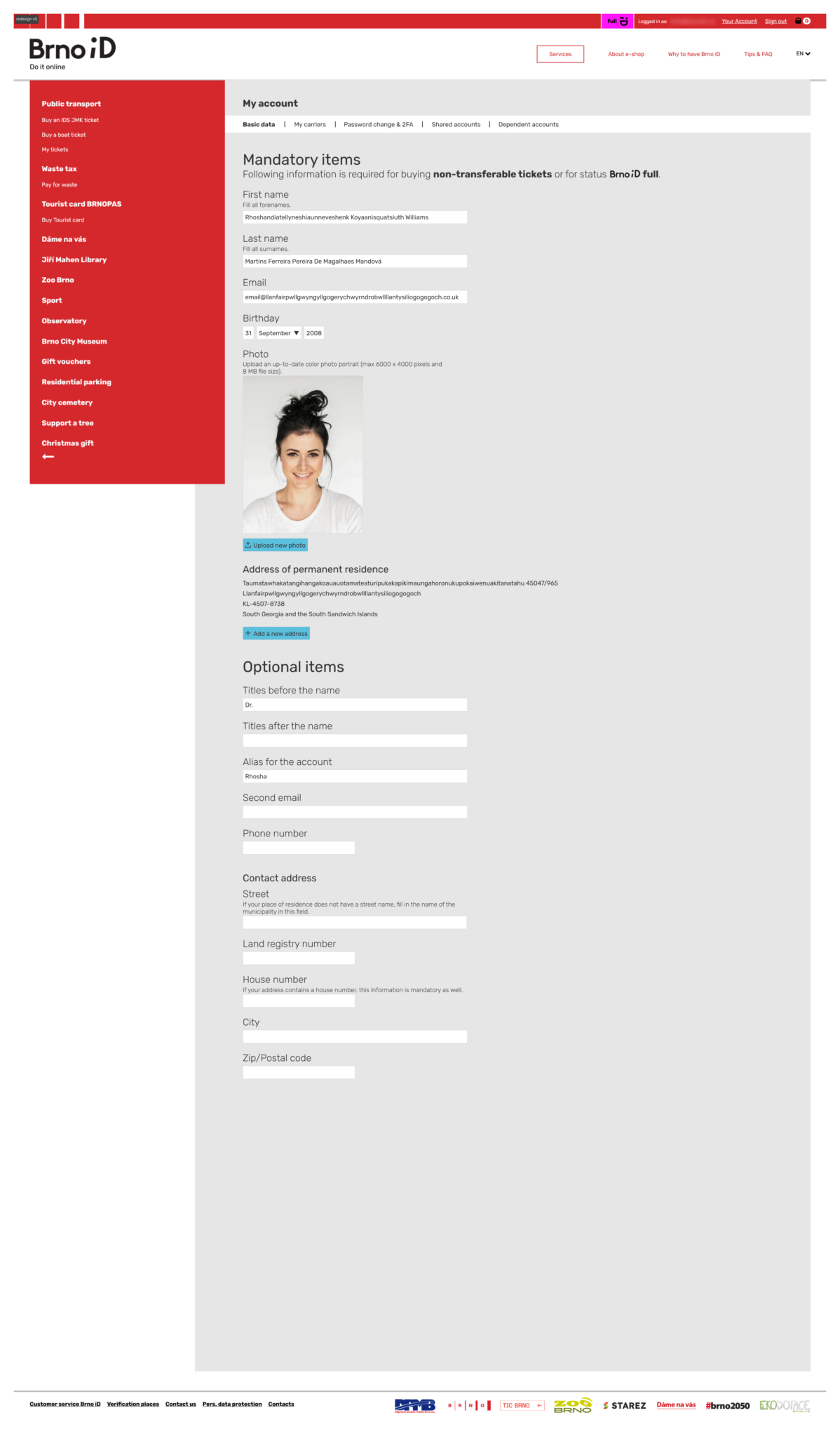
Original account page
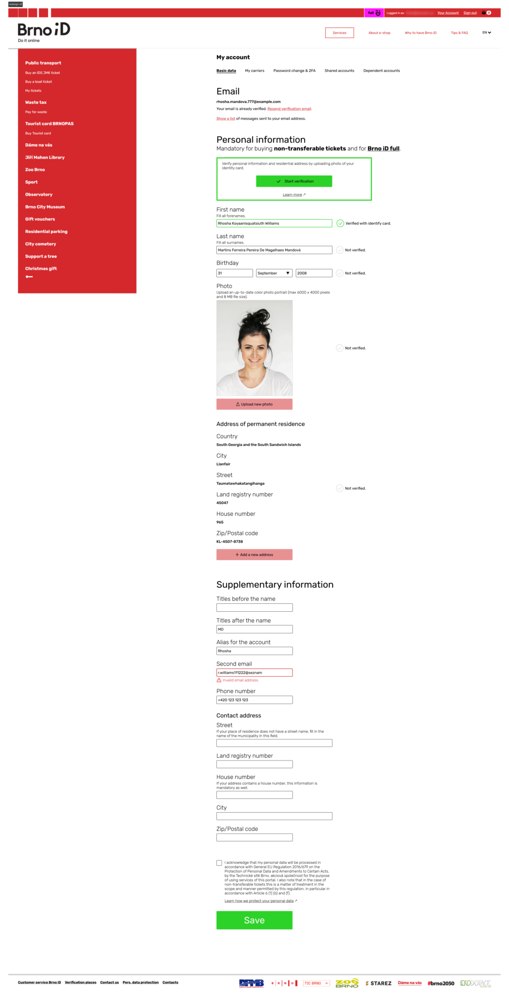
When I saw the original Brno iD account page (more specifically the basic data page with my information) it immediately struck me that I could make a redesign.
Take a look yourself:
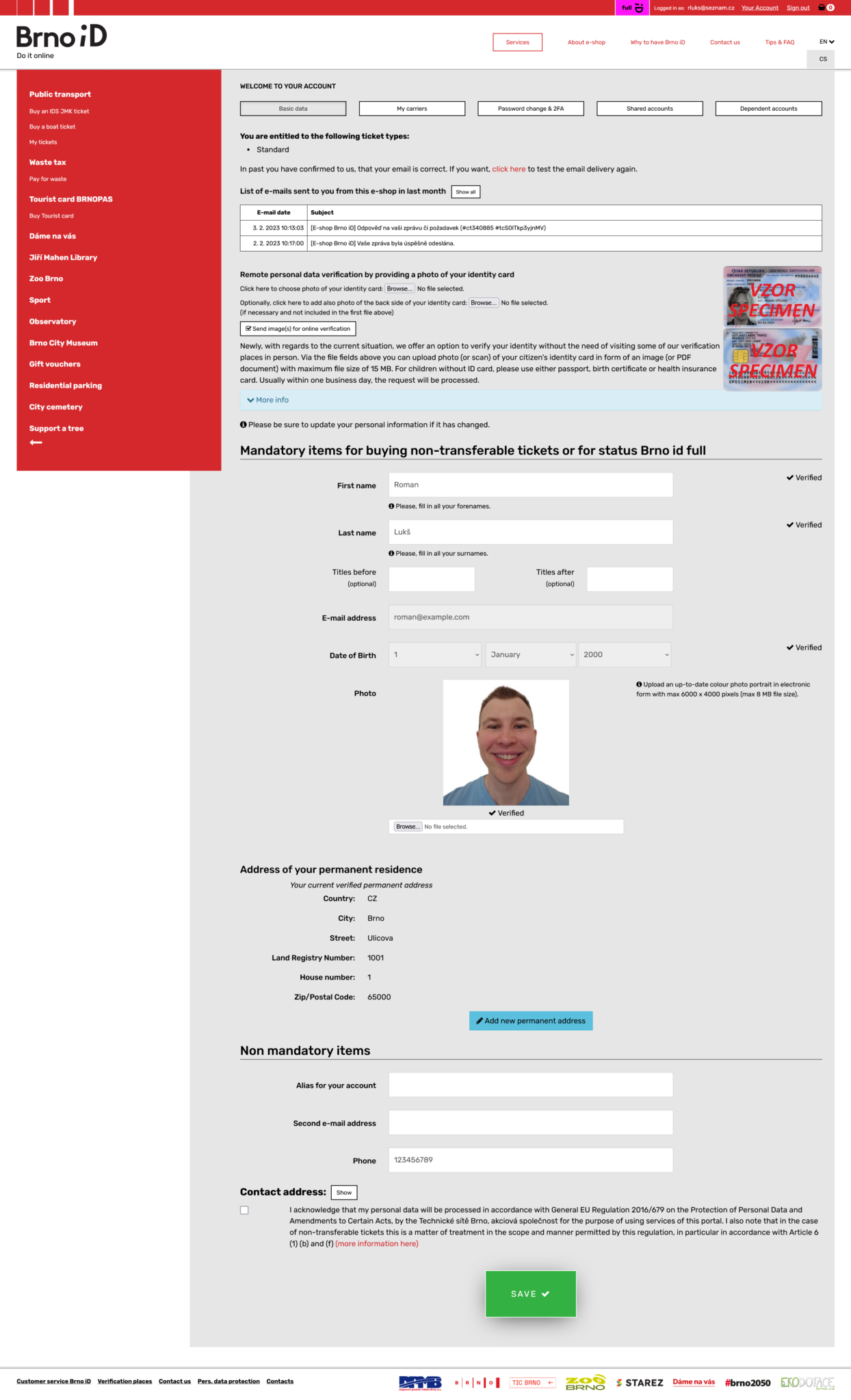
Note: I’ve replaced real information with dummy data for privacy reasons.
View images in full screen: Right click + Open image in new tab
It’s not the worst page but I thought I could make a redesign that would be better.
Judgment time!
Let’s walk through the original page. I’ll comment on some of the issues I’ve noticed.
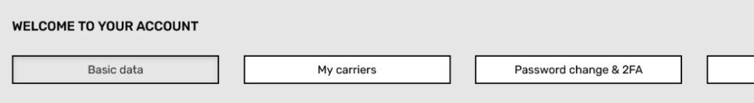
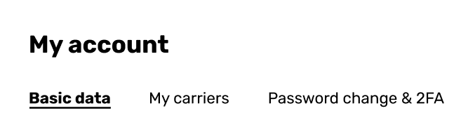
Navigation
Navigation looks like separate buttons instead of one cohesive unit:
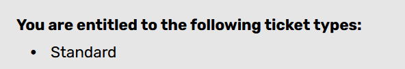
Entitlement
Ticket type entitlement is relevant during the process of buying a ticket. It doesn’t need to be on this page:
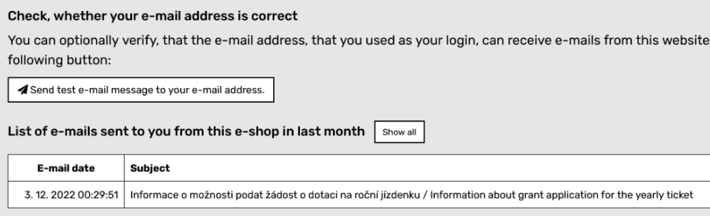
The email verification section is too wordy. The email log is a low-priority element that doesn’t need to be at the top of the page. It makes for a poor visual hierarchy of the page:
Verification
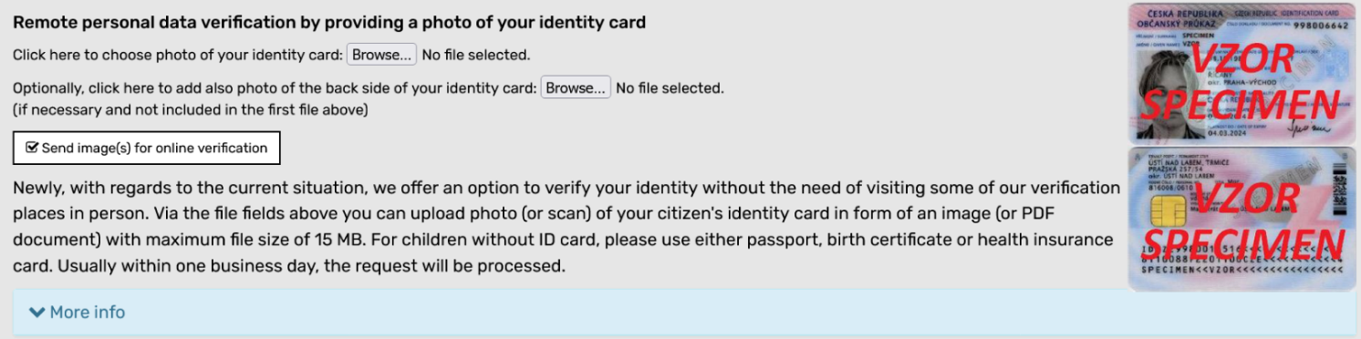
The next piece of content is only relevant during the verification. It doesn’t need to be always visible:
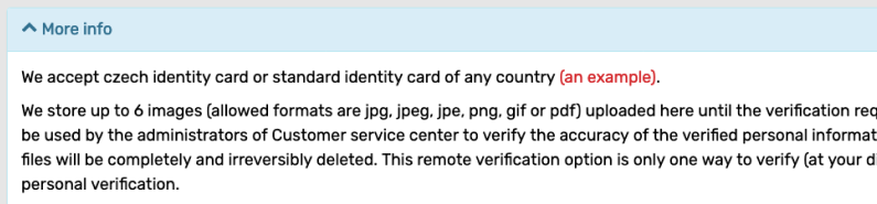
There is more info related to verification hidden under “More info”:
Heading
A wordy heading (a nitpick but still):

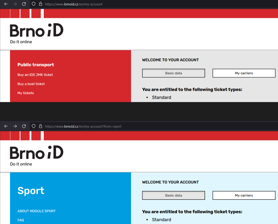
Brno iD full
What’s Brno iD full? Here you go (this is a screenshot from different page):

Hints
Hints should be placed after the label for accessibility, not below the field:
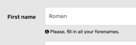
Titles
Why are optional titles mixed with mandatory items?
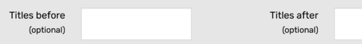
Email field
The email field is read-only and can only be changed via support. Not very user-friendly.
Moreover, the disabled input could have a better contrast:
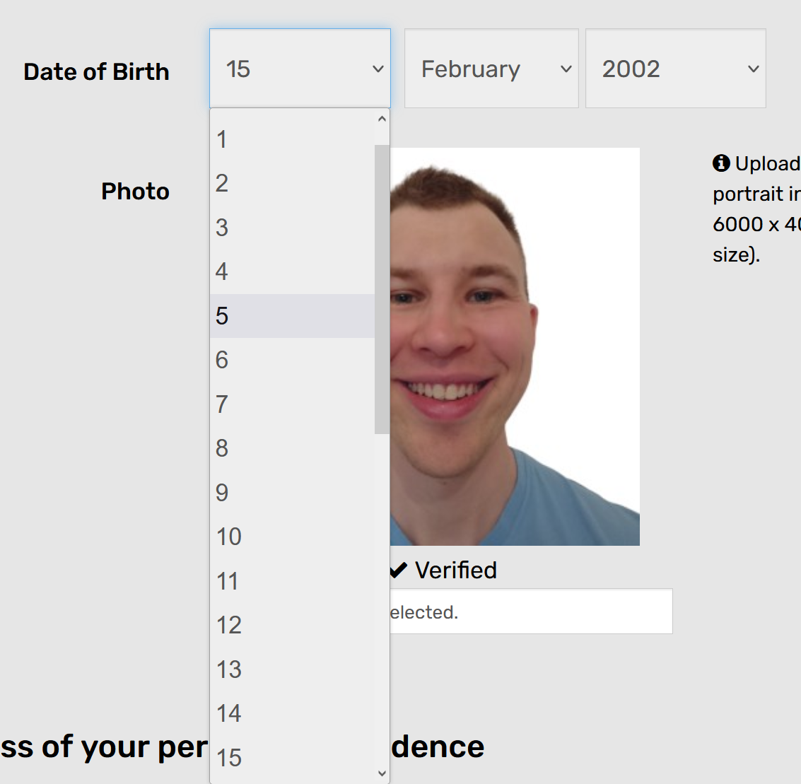
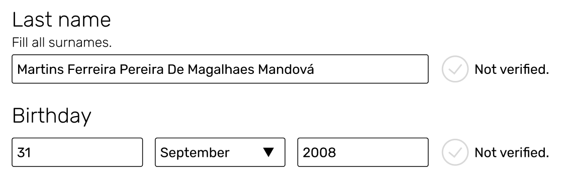
Birthday
The dropdown for day and year doesn’t make sense – there are too many items on the list. Birthday input fields are in disabled color as well, nevertheless one still can interact with them, strange:
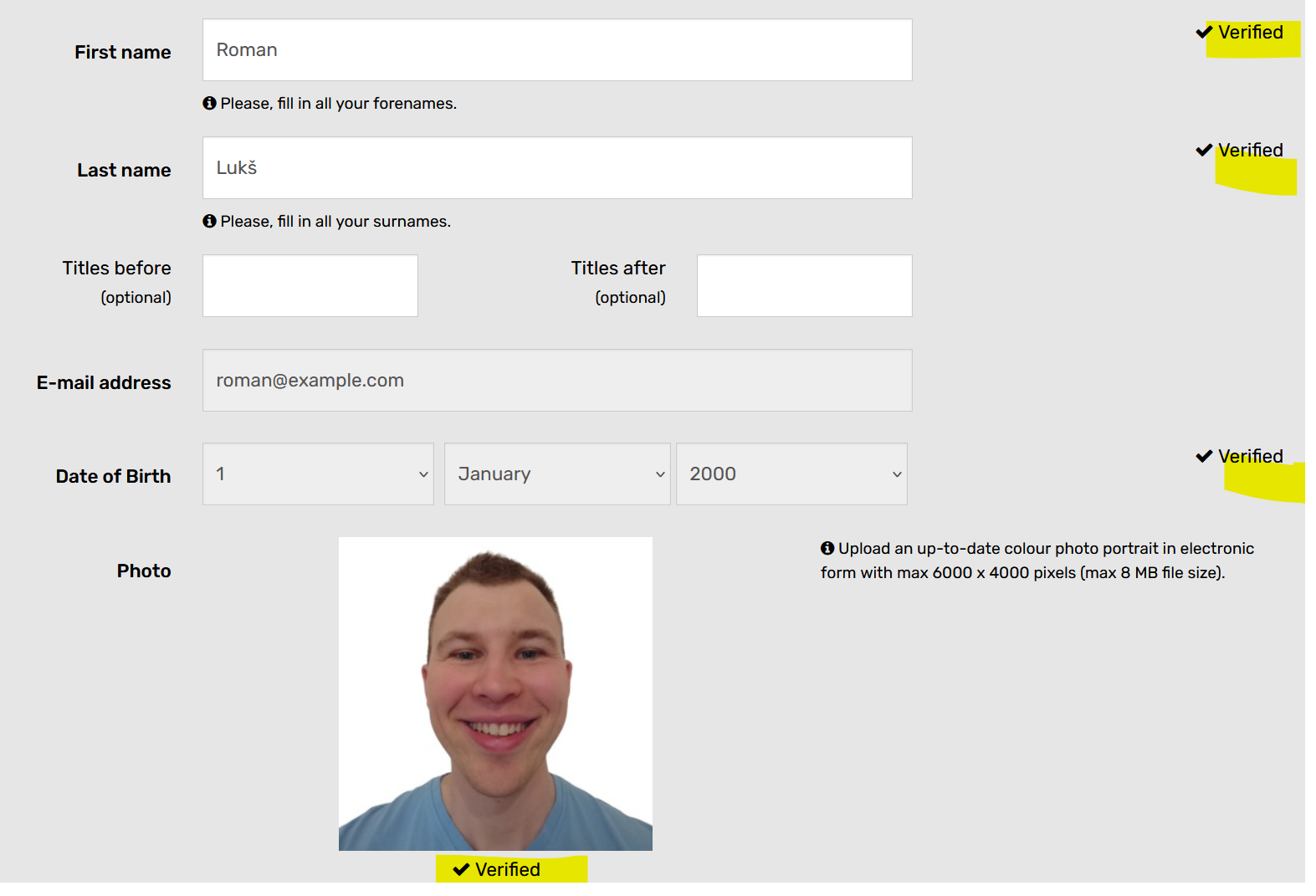
Verification indicators
Verification indicators are inconsistent in placement. Interestingly, titles don’t have any. Keep in mind that email is verified differently from personal data:
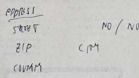
Address
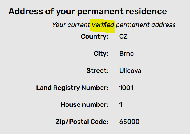
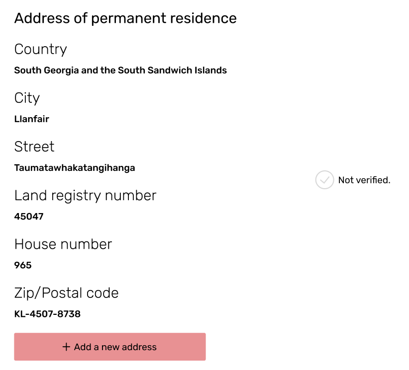
Address verification indicator is inconsistent with the rest – the verified address is indicated by text instead of an icon:
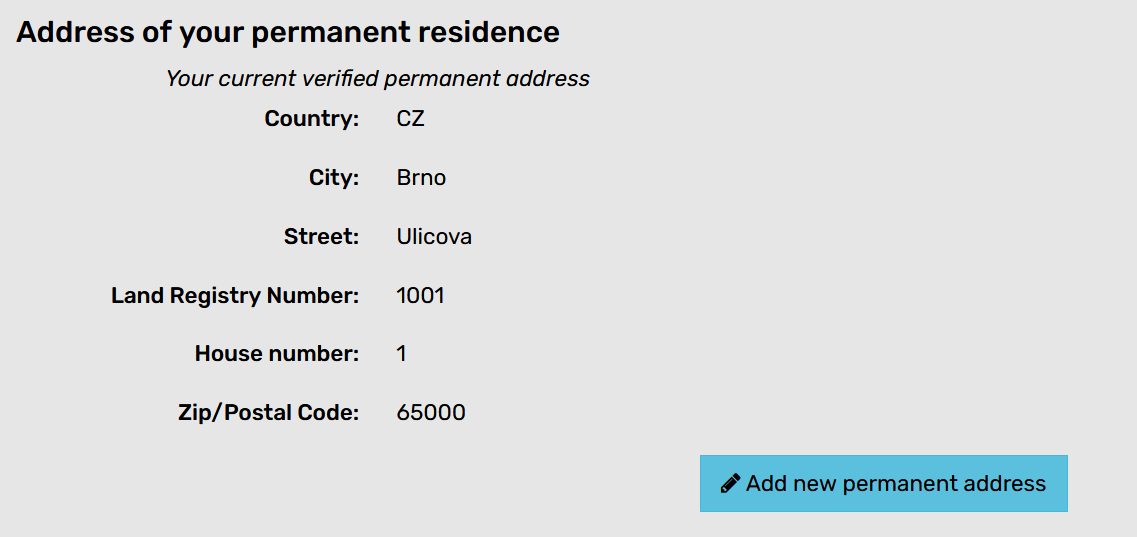
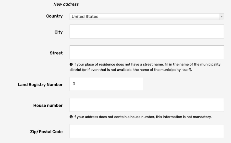
Notice that address is read-only. I don’t see an option to change it directly. The user can only add a new one. I haven’t tinkered with it because I don’t want to mess up my account (I do use it you know):
This is the new address form (with random values). It expands below the existing address:
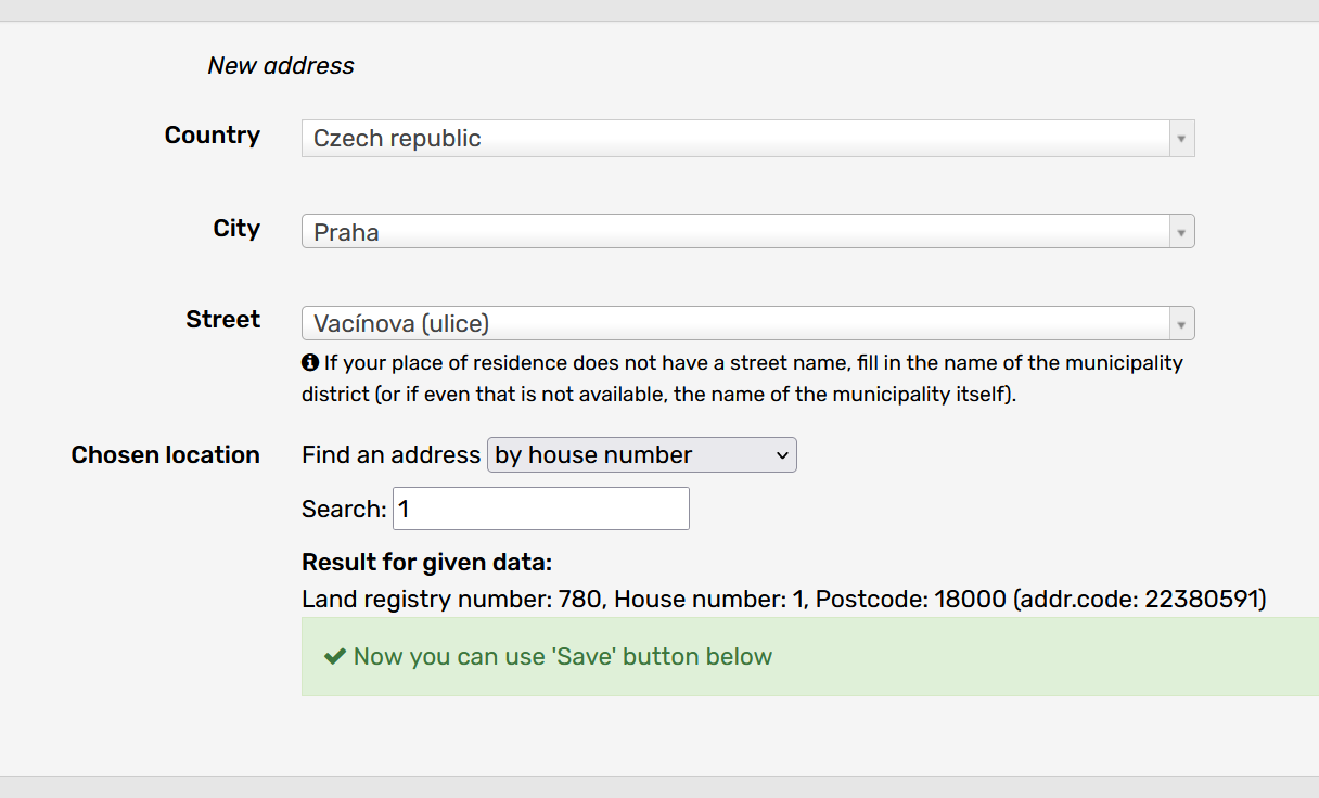
The format changes when a different country is selected:
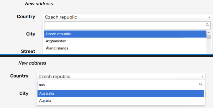
Dropdown with filtering is very practical:
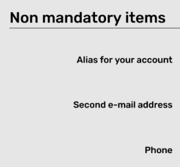
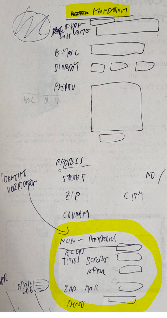
Non-mandatory
Why do they even ask for non-mandatory items? I’ll keep these in the redesign because I assume they need them, for some reason.
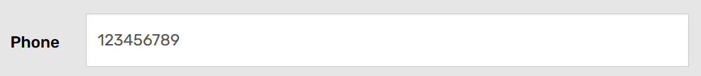
Phone
The phone input field is way too long for an expected input length:
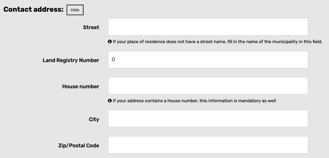
Contact address
The contact address is hidden by default. It looks a bit messy:

Expanded contact address:
Save button
The save button is the only one with a background shadow. A bit too chubby as well. It doesn’t fit with the rest of the buttons:

Background color
The page background color is based on the referral page (default grey vs blue for sport). This is an utterly unnecessary complication to keep the website accessible (color contrast):
Error tooltip
The error tooltip shows up only after the page is submitted and it’s hard to see (covered by modal overlay). Furthermore, it goes away on clicking anywhere. Very. Bad:
Commence redesign
Let’s grab a few old papers, turn them blank side up, and sketch.

Note: All drafts are “encrypted” with Roman’s poor handwriting. Sorry.
First draft
My first draft deals with the order of elements on the page:
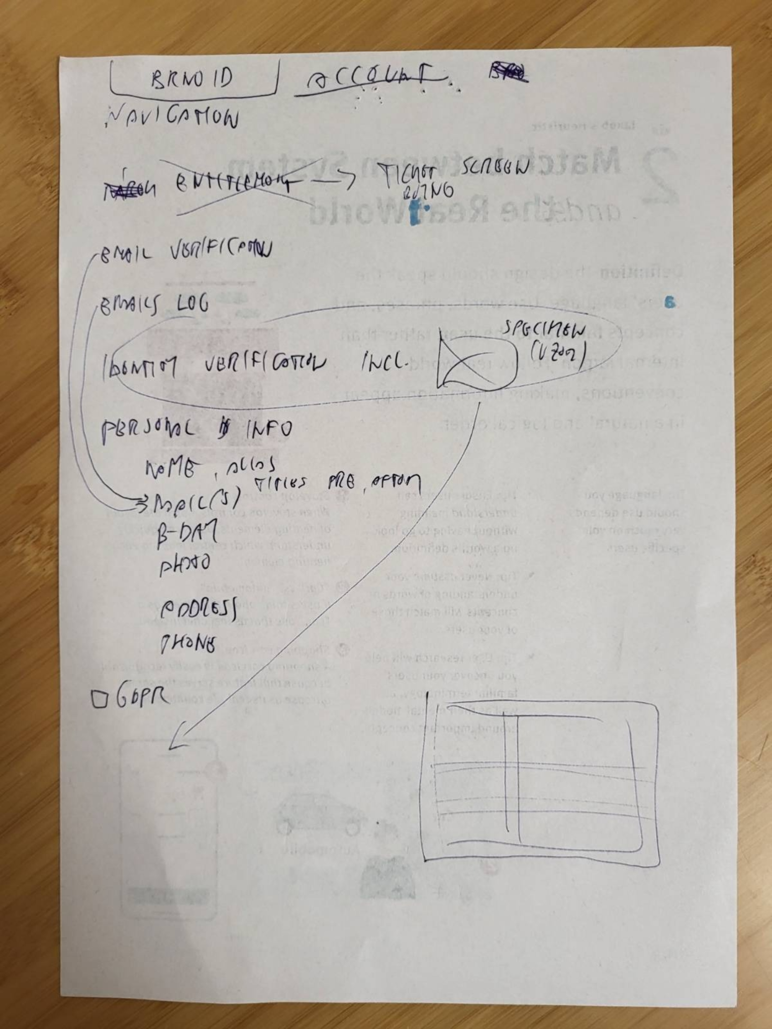
Ideas in the first draft:
- Remove entitlement because it doesn’t make sense here.
- All email–related content should be together.
- Move identity verification information to the end of the page.
- All personal information is in a single form.
- Use a consistent grid layout for the whole page.
In my first draft, I was aiming to simplify as much as possible, reorder & remove items, and unify the page structure.
Second draft
My second draft goes into a bit more detail and refutes some ideas from the first draft:
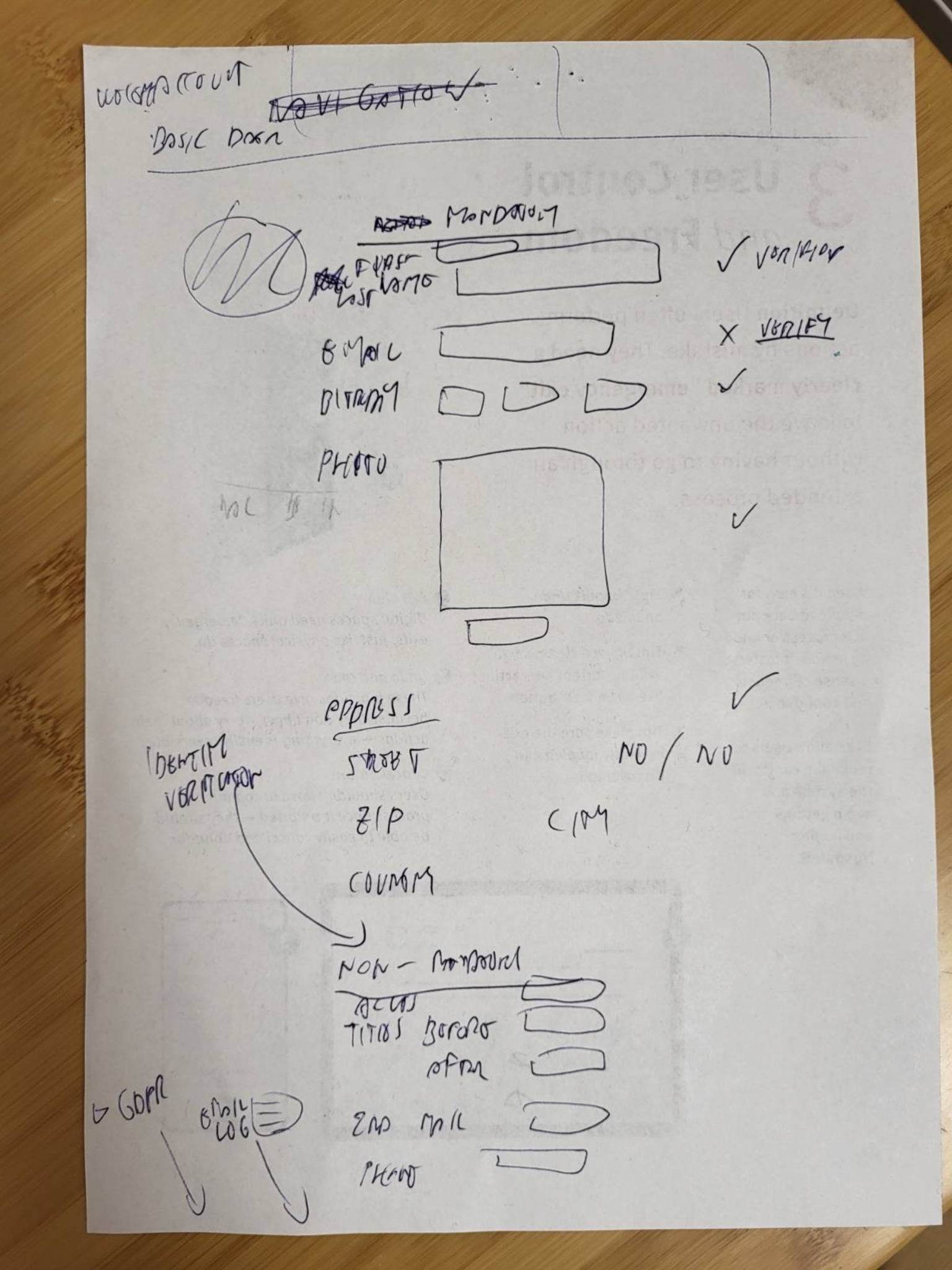
Let me walk you through the 2nd draft.
Personal information
Personal information that is mandatory for Brno iD full gets a preferable treatment and is placed first. Non-mandatory items are moved to the bottom:
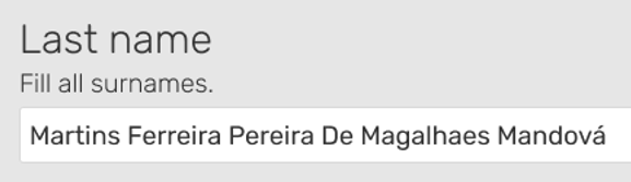
Names
I was itching to combine names into a single input field but remembered project constraints. The first and last name are probably two separate columns in the database. Making this change would probably break things.
Verification indicators
Verification indicators are made consistent: a single column of checkmarks (including one for the address). Users can start verification by clicking the link next to the unverified item:

Low-priority elements
Identity verification information is placed after the address. The email log is moved to the bottom of the page (as it’s a low-priority element):
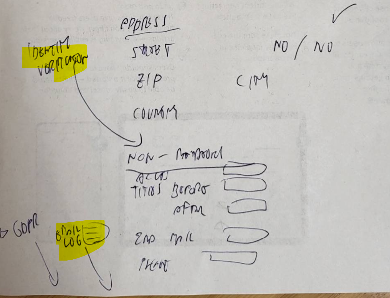
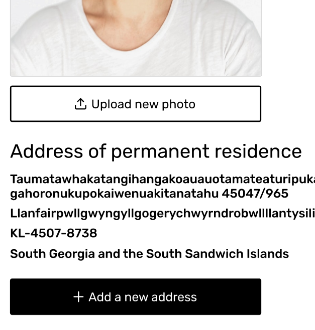
Address
The address is made more compact. The first line includes the street name and both numbers (land registry number and house number). The second line includes the zip code and city. The last line is just the country:
Draft #3
I explored different states of verification indicators and also an error state for inline validation.
States would be color-coded:
- green: verified
- blank/dotted line: not verified
- red: error
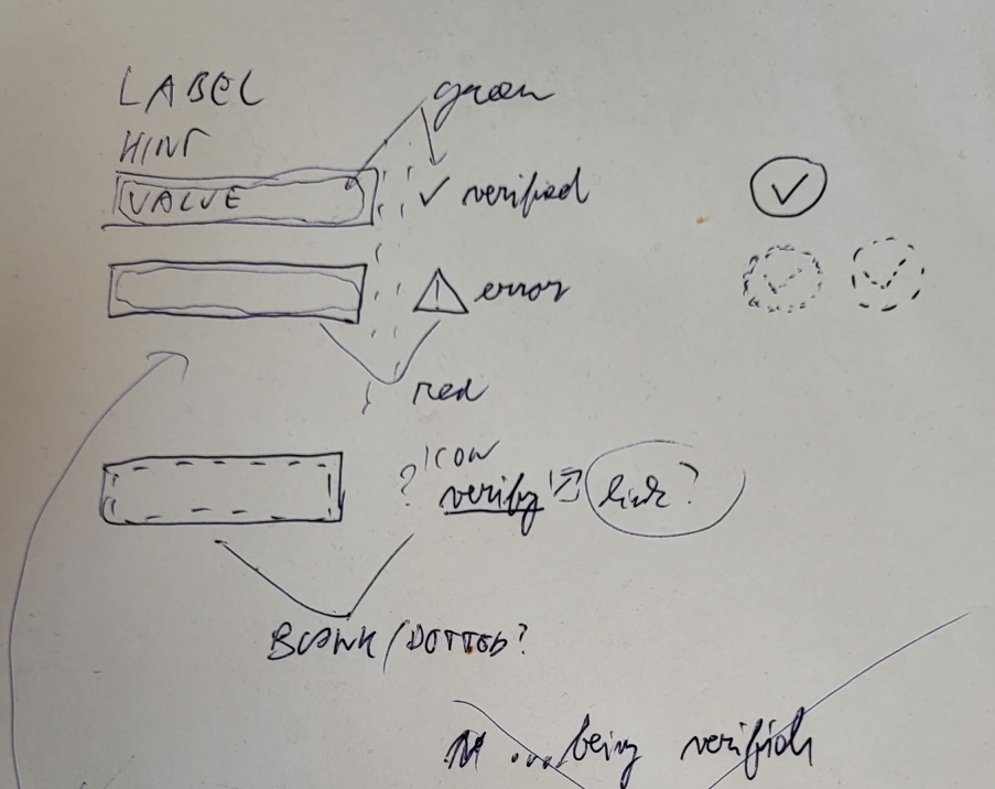
Verified information would be accompanied by a green checkmark symbol. Input fields would be highlighted with respective colors.
I was considering an extra state “…being verified” but decided not to go with it because the original page doesn’t have it.
The third draft was the last one before diving into Figma.
Iterations in Figma
Pen and paper are great for initial problem breakdown. It’s fast. Changes are cheap. A great tool for broad strokes.
The downside is that elements are not to scale and are all over the place. Alignment is non-existent. I mean, I could use a ruler… but if you want things to look pretty why not just use the computer tool?

Let’s jump to Figma.
Canvas
The first thing I did was set up a blank canvas for my Figma adventure:
Iteration zero
This one is feature incomplete. I’ve set up the basic navigation and form elements. I was following the direction set by my second paper draft.
The first iteration took me a while.
Form layout
I was researching form best practices and accessibility guidelines. Based on those and what I already knew I decided to use a single-column form layout with left-aligned labels.
It offers great scanning speeds and it looks kind of neat. The form fields stay aligned. It doesn’t matter how long are the labels.
Hints are placed immediately after labels for accessibility (eg. easier for people with screen readers). Their font size is also bigger thus making them easier to read.
Font
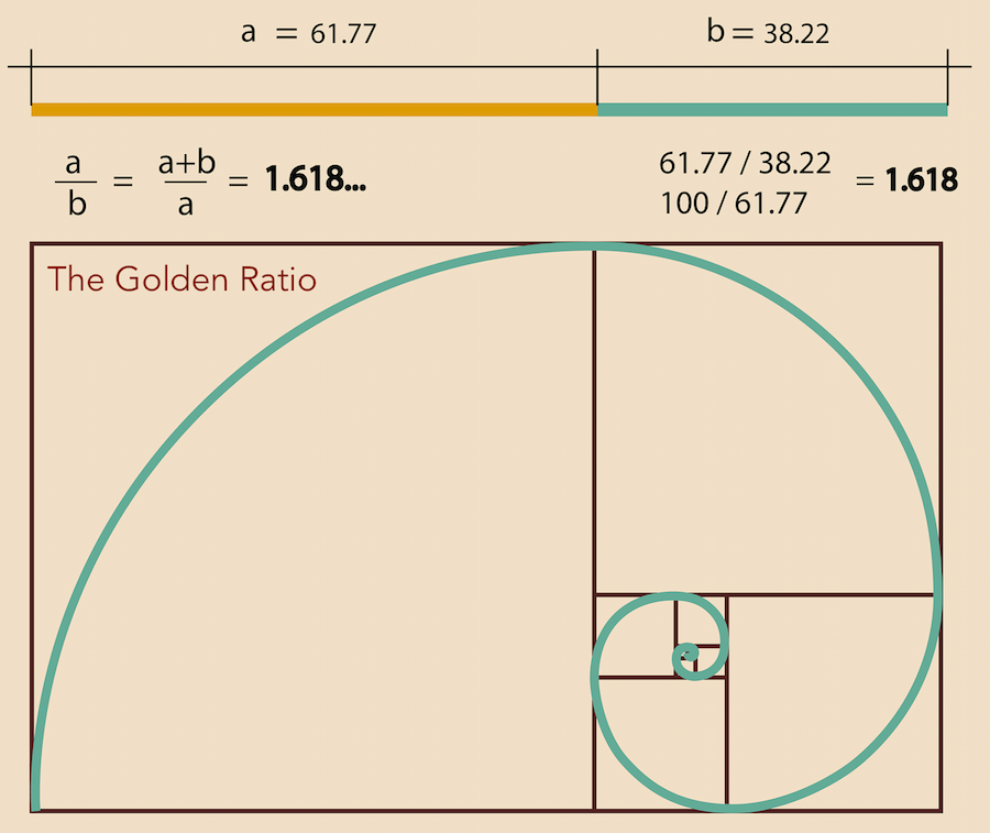
I used the same font as the original: Rubik. The golden ratio was my friend when specifying text size for various elements. Occasionally, I would increase the font weight to make it stand out more.
Placeholders
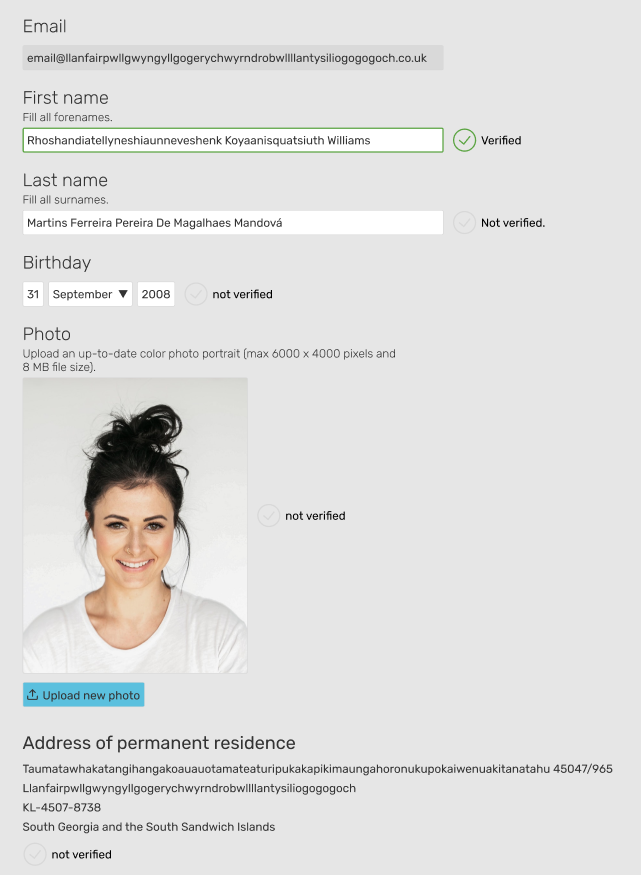
As a dummy text, I used the longest possible values. This would ensure my design would be able to accommodate it. The downside is it kinda ugly, init mate?

Meet Rosha, our placeholder user:

Heading
The long heading was shortened. Extra information was moved into the description below.

Iteration numero uno
I added verification indicators based on paper draft 3. This led me to move up email (and made it read-only). The remaining fields all have verification indicators. In this iteration, I chose to place verification indicators close to values.
Iteration #2
The second iteration is way more complete than the previous two.
Alignment
Verification indicators and other elements were aligned. This looks better than the previous version.
Email verification
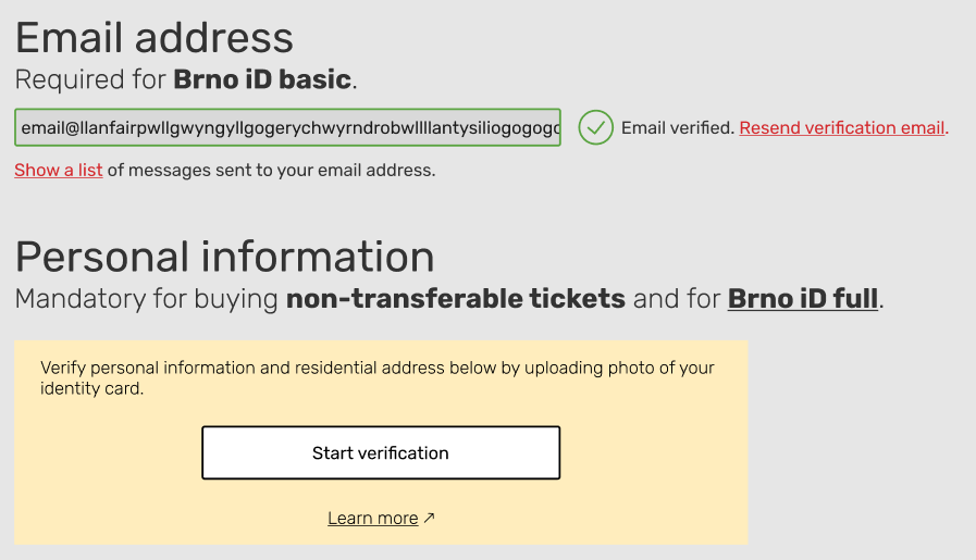
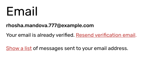
I believe users are used to email verification by now and don’t need detailed instructions. Entire email verification is reduced to a single link. The email log is hidden under a link as well:
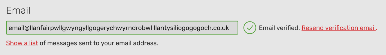
Just a reminder, the original email verification and log look like this:
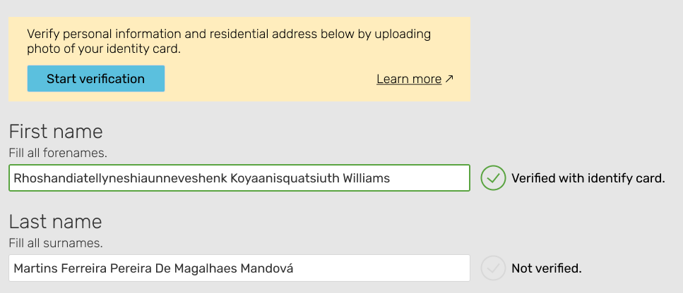
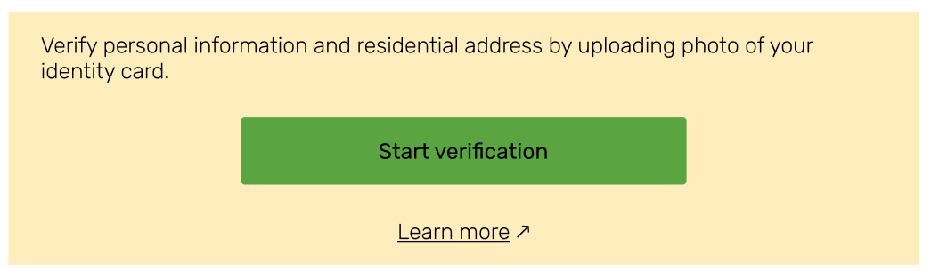
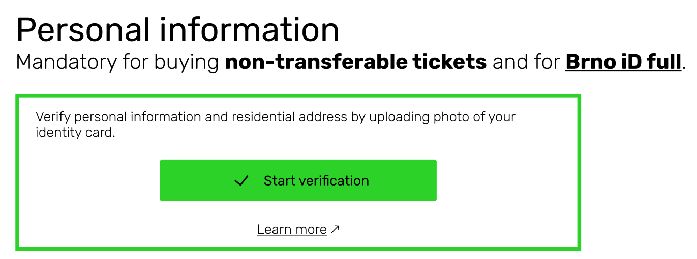
Verification card
A new addition in this iteration was the verification card with a call to action. It would only show up when there are unverified values. All the details about the process of verification are tucked away. The yellow color should make it stand out.
The original:
Inline validation
I added an inline validation error:
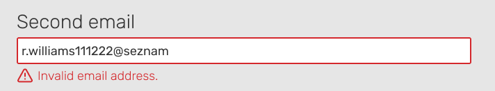
The red color and warning sign makes it clear there is a problem.
The original:
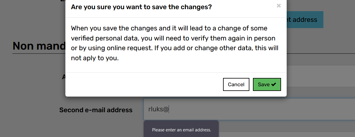
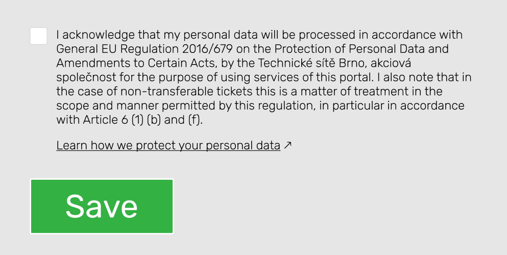
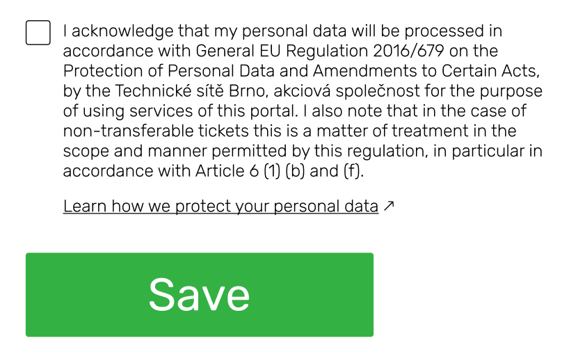
GDPR and save button
Lastly, I added the GDPR checkbox and a save button. I removed the button’s shadow and made the text bigger.

Original:
Iteration three
I improved upon the GDPR section and the button. I reduced the text weight and adjusted the save button aspect ratio.
I started playing around with Auto layout in Figma. This iteration was my checkpoint in case I mess things up.
Iteration 4
Similar to the previous iteration: minor tweak to the save button and further experiments with Auto layout.
Navigation
The only bigger visual change was in the navigation: the white background was removed. The white background was distracting even though it unified navigation as a single unit. The gestalt principle of proximity and users being familiar with simple navigation like this should be enough.

Feedback session
At this point, I was all out of ideas. I knew the design could be improved. I just didn’t know how.

Luckily, Jason, one of my colleagues at Red Hat, was so kind and gave me feedback.
Furthermore, Lenka, one of the UX people I met at a UX meetup, offered her help and added a great number of comments to my Figma project.
I’m incredibly grateful to both of them. Thank you, Jason and Lenka.
I won’t list all the feedback I got, only a few examples:
- It wasn’t clear that the mandatory items were only needed for Brno iD full status. In fact, the Brno iD account only requires an email address for basic status.
- The buttons are way too small and don’t fit the Brno iD brand.
- Input fields and placeholder texts are too long.
- Page content could be centered.
Iteration five
I separated email from personal information, changed buttons, and centered the content.
Verification card
Also, I played around with the layout of the verification card.
Buttons
It’s worth mentioning that I wanted to distinguish buttons from input fields. The distinction should be obvious at the first glance. I experimented with black buttons with white labels. Those felt too visually heavy. I went with white buttons with black labels. This style is already used by Brno iD anyway.
Iteration #6
I made small changes to the width of the buttons.
Iteration seven
I removed the ugly grey page background! A major change that impacted input fields, buttons, texts…
Buttons
Once more, I needed to distinguish buttons from labels. This iteration has 4 buttons, each one a different style. I was experimenting. It doesn’t make a consistent design though.
I removed the email input field and replaced it with bold text. It didn’t make sense to have a read-only value inside an input field. It’s easier to achieve a good contrast without the greyed-out input field.

Navigation
Removing the email input field messed up the layout and it needed to be adjusted. I wasn’t particularly happy about the result.
I added an underline to the selected item in the navigation:
Feedback session 2
I had a call with Lenka and received good feedback that moved the redesign forward.
Iteration #8
Based on feedback, I shortened the placeholder text and I changed the colors.
Colors
Finding the right colors proved particularly challenging. In the end, I settled for the ones suggested by HTML CSS Color. Anyway, I feel like better colors are still somewhere out there.
Updated verification card:
I shortened the email title, removed the description, changed placeholder text and added padding between email log and the rest. It’s cleaner and easier to scan.
Birthday
Birthday input fields were expanded and aligned to the columns.
Previously, I chose to keep them short to communicate the expected length of the input (up to two digits for the day and 4 digits for the year). This looks more organized though.
Address
I added labels to the individual parts of the address. It presents information in a structured way.
It ended up looking similar to the original:
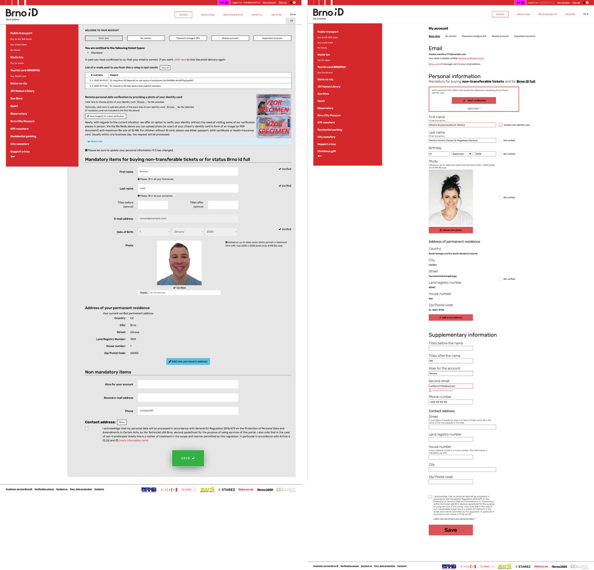
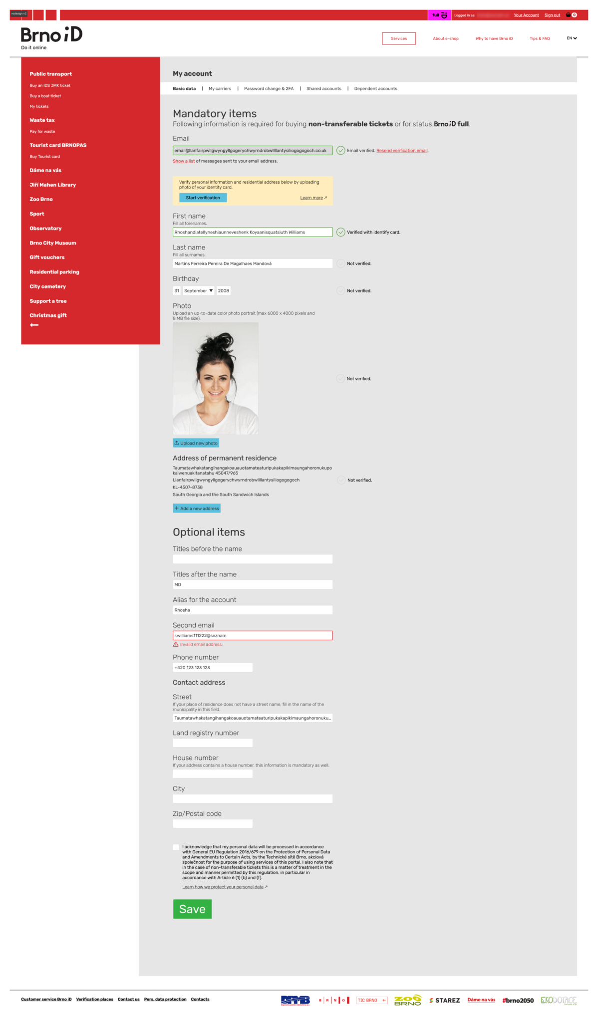
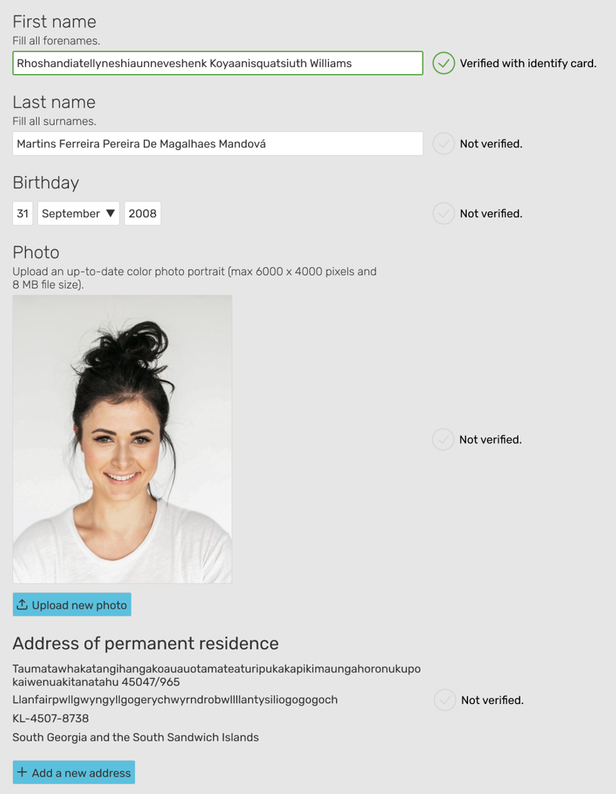
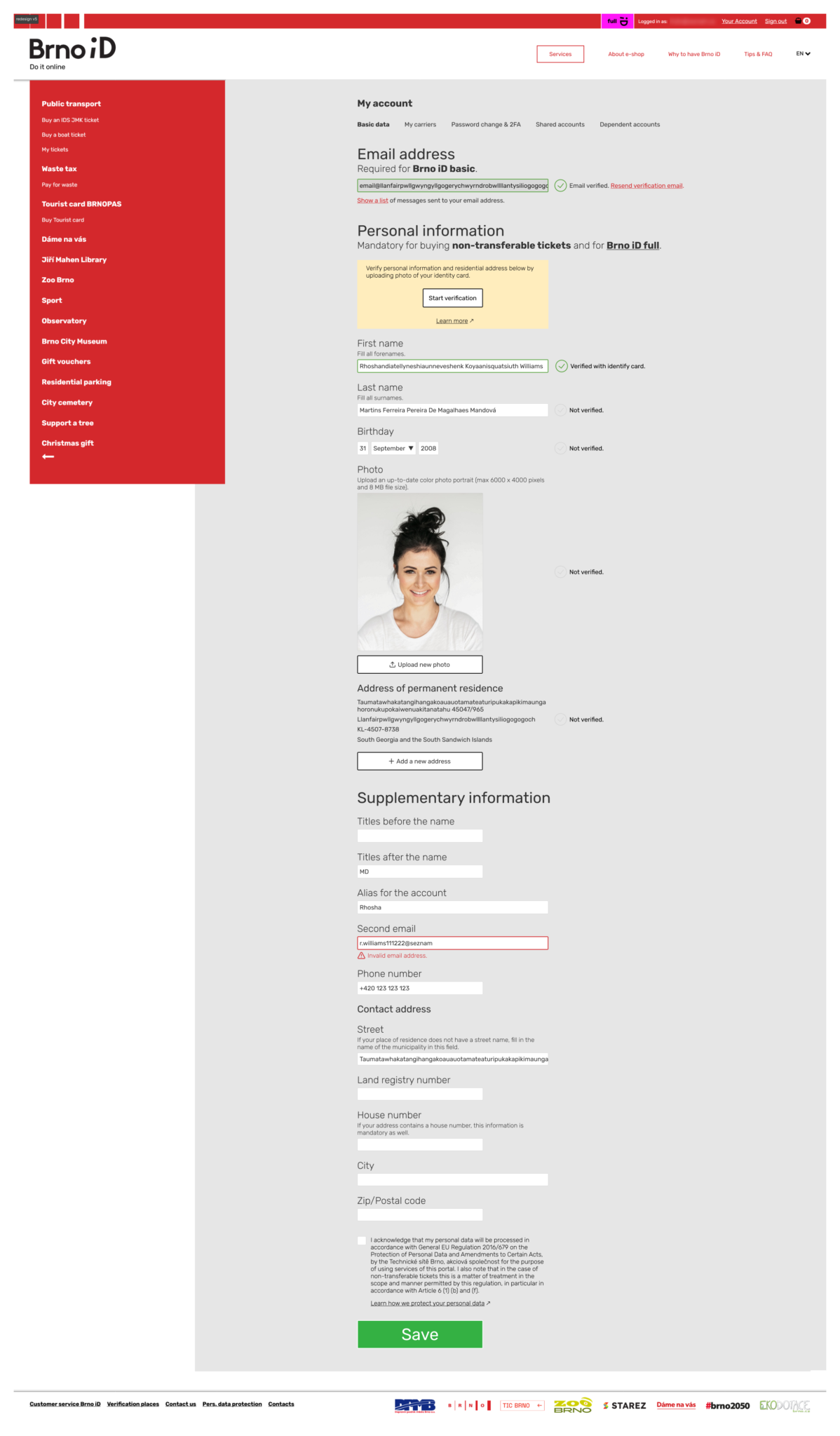
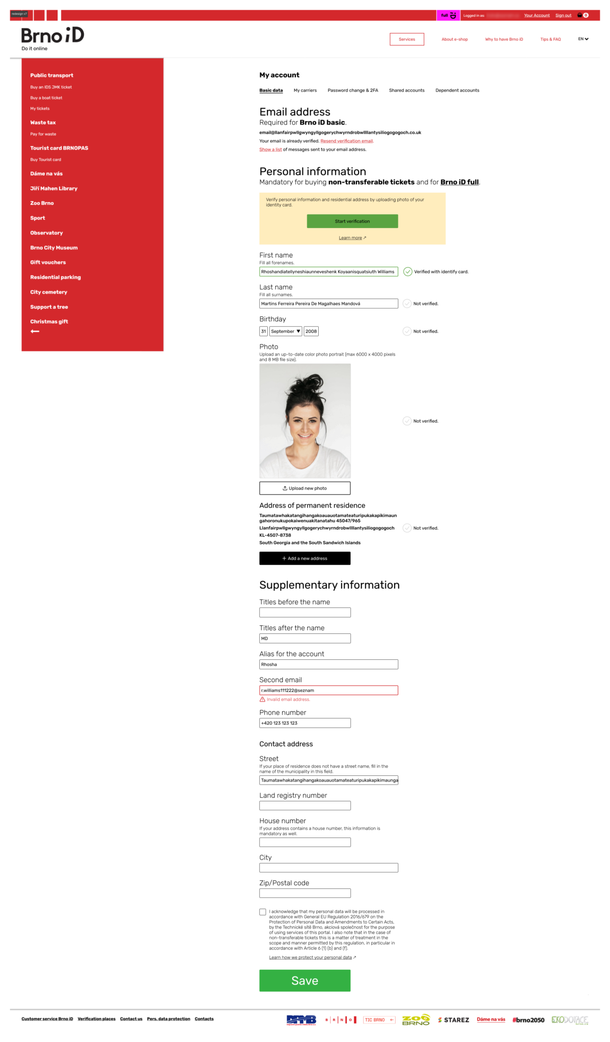
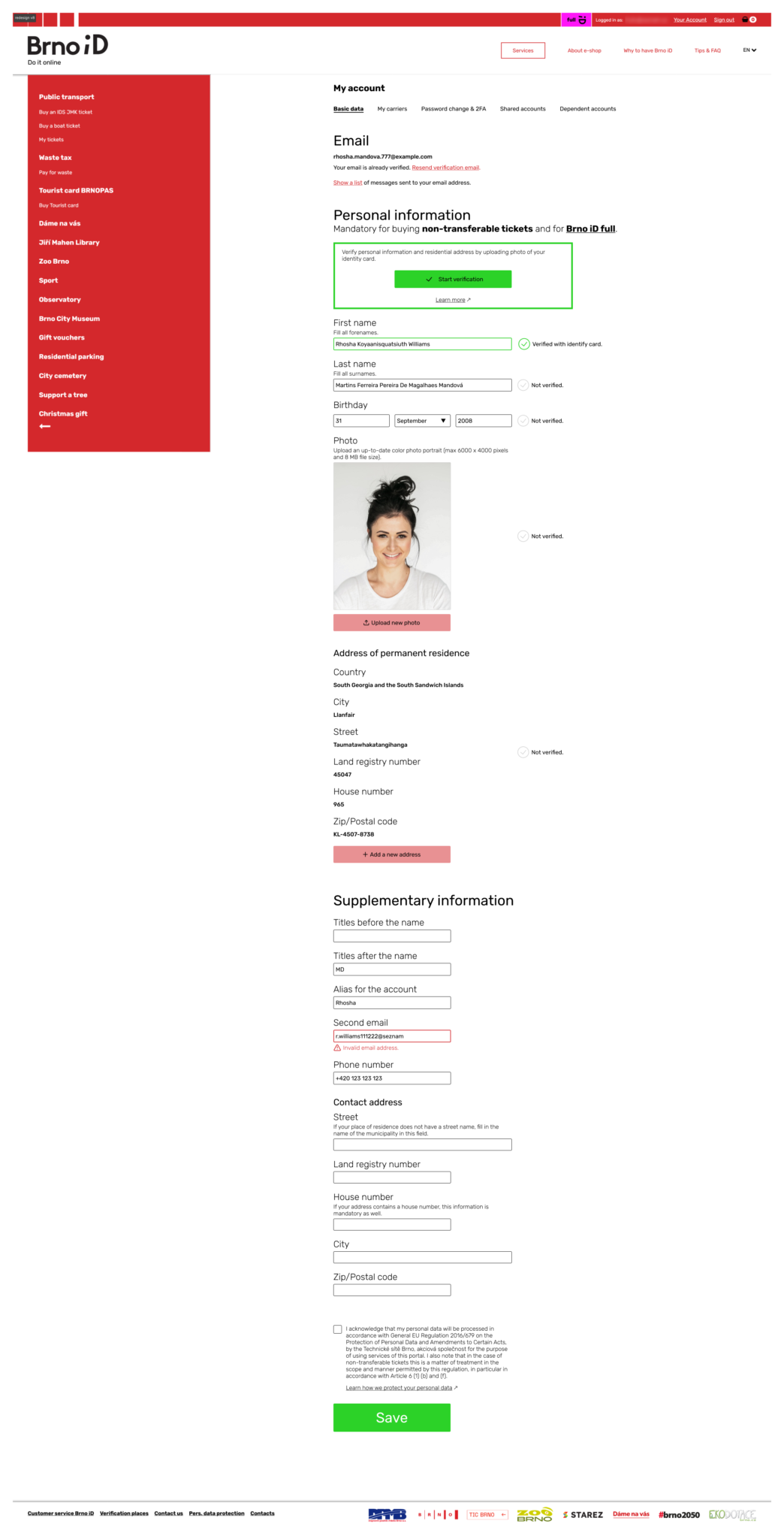
Redesign (v8)
Last iteration, number 8, is the redesigned Brno iD account page.
View images in full screen: Right click + Open image in new tab
And the original:
Takeaways
It was a great learning exercise. I studied best practices for forms, and accessibility guidelines, and took advantage of the Auto layout feature in Figma for the first time.
I’m glad I set project constraints for myself. Otherwise, I would still be redesigning, making more and bigger changes and never finishing.
UX design can’t exist without feedback. I didn’t have a clickable prototype to test with users. Nevertheless, at least I got some from fellow UX people and it helped tremendously.
It was very easy to spot a poorly designed page (the original). It took me a significant amount of time to actually design something better (and I’m not 100% satisfied with the result).
Once, I lost an internet connection and realized I can’t open anything in Figma. I couldn’t listen to any tunes on Spotify either. Folks, I got some bad news for ya – we’re dependent on the Internet!

Redesign (v9)
Update: I was haunted by the ugly colors. Here is version 9 with fewer colors. It looks nicer, doesn’t it?
Project: Redesign of Brno iD account page
Date: 2023
Duration: 40 days +10min to change the colors for v9
Team: Roman Luks (UX)
Consultation: Jason, Lenka
Tools: Paper, Figma